All data comes from somewhere. Some of it originates within a source system, such as when department assistants build the class schedule within PeopleSoft CampusSolutions or when a purchase requisition request is created and then processed within PeopleSoft Financial Management. Other data is collected externally and then sometimes added to those systems, where it can be further edited or updated, such as when undergraduate students use Common App to apply to our university, where they provide their names, addresses, and high school records.
Data Collection
Some data collection is handled on a smaller scale, such as for the purpose of a survey or for a single department’s use. The Chapman community has access to several tools such as Qualtrics and Microsoft Forms that can make data collection more uniform and immediate than filling out a PDF form or compiling responses via email. Browse the available options and decide which is best for your project at IS&T’s Survey/Form Software page.
Quick links to popular offerings are available below.
Not sure which one is for you? Read up on how they’re different.
Data Analysis
Data Reporting and Visualization
Once data are collected and analyzed, they are often shared in the form of reports in order to communicate the core discovery or message that analysts have found in that data. Those reports can be delivered through a number of different services and providers, depending on the source of the data and the format of the report.
Microsoft Excel
Microsoft Excel can be a great resource when quickly summarizing your data in the form of a pivot table or graph to be printed or shared in a presentation.
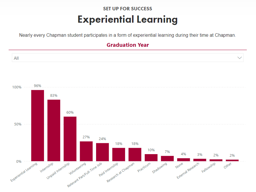
PowerBI is a Microsoft product specializing in visualizations such as charts and other graphics, although it can be used to display limited textual reports as well. Anyone with a Chapman or Microsoft account can use PowerBI to create reports and dashboards using data that they provide, although different licensing and elevated access may be required to share those reports publicly or specifically with members of the Chapman community. If you’ve ever created a bar graph or pivot table in Excel, you’ll already be familiar with what PowerBI can do.
Chapman’s Leatherby Libraries have an excellent guide discussing the various avenues of data visualization, including PowerBI. Please check out their Libguide offering on Data Visualization!
Example:

SSRS (SQL Server Reporting Services)
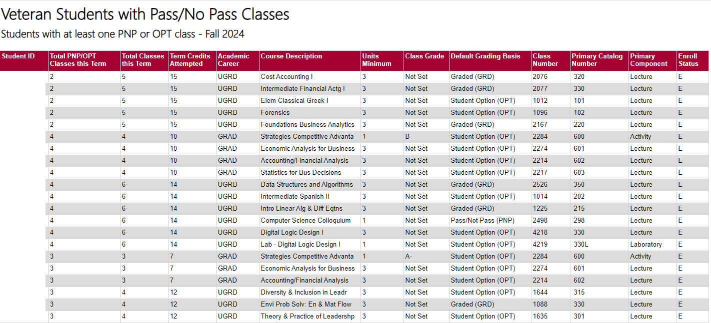
If you’ve ever viewed or downloaded a report from Panther Analytics or Chapman’s Data Warehouse that resembles a spreadsheet, it was probably an SSRS report. SSRS is chosen to deliver reports with many columns and rows of detailed information which isn’t summarized or aggregated. SSRS reports are often referred to as paginated reports because the data requires multiple pages in order to display it all.
Very large and detailed SSRS reports can be challenging to navigate and follow in the web browser, but they can be easily exported to Excel or CSV formats where you can view and summarize the data further. Remember to be mindful where you save your data.
Example:

