New Components Demo
Info Cards
Use this component to highlight a series of related information. Cards can be displayed in sets of 2–4, with optional images and call-to-action buttons.
Card 1
Card descriptions go here. All cards in this series will automatically match the height of the tallest card.
Button 1Card 2
Card descriptions go here. All cards in this series will automatically match the height of the tallest card.
Button 2Card 3
Card descriptions go here. All cards in this series will automatically match the height of the tallest card.
Button 33-Column Content
Use this component to display a list of items neatly organized into three separate and responsive columns.
- Column 1 content
- Column 1 content
- Column 1 content
- Column 1 content
- Column 1 content
- Column 1 content
- Column 1 content
- Column 1 content
- Column 1 content
- Column 2 content
- Column 2 content
- Column 2 content
- Column 2 content
- Column 2 content
- Column 2 content
- Column 2 content
- Column 2 content
- Column 2 content
- Column 3 content
- Column 3 content
- Column 3 content
- Column 3 content
- Column 3 content
- Column 3 content
- Column 3 content
- Column 3 content
- Column 3 content
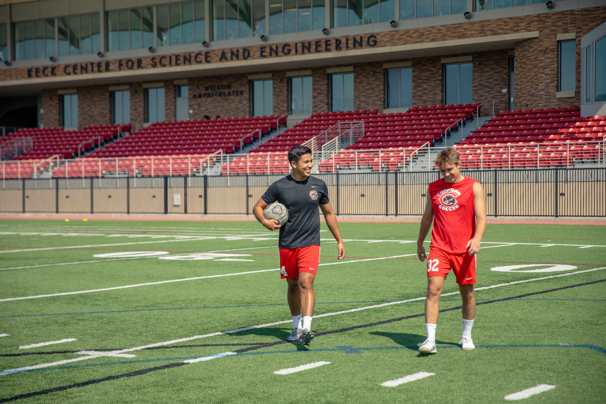
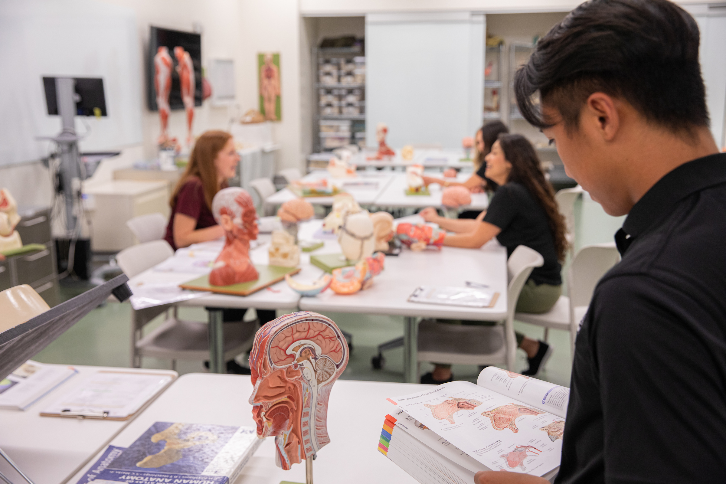
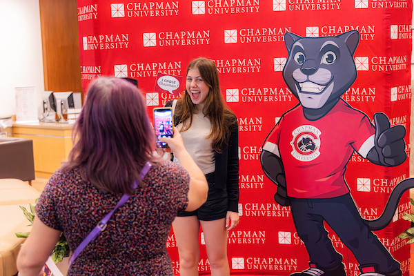
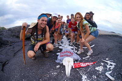
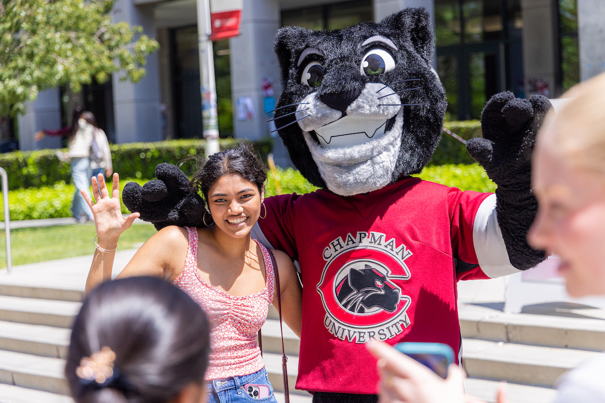
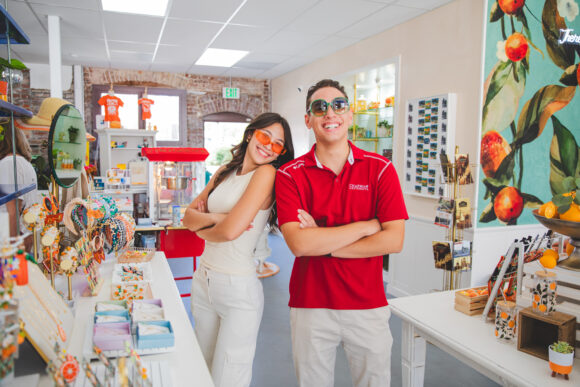
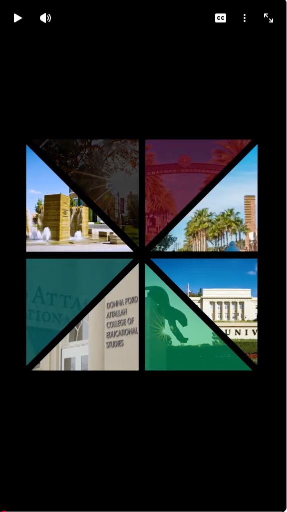
Image Thumbnail with Lightbox Gallery
Add multiple images to display in a four-column gallery. Images and any included captions will open in a lighbox when clicked.


Video Gallery with Thumbnails
Add up to four YouTube or Vimeo videos to display in the gallery.
Select a video to play


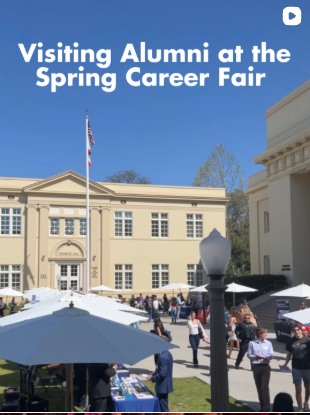
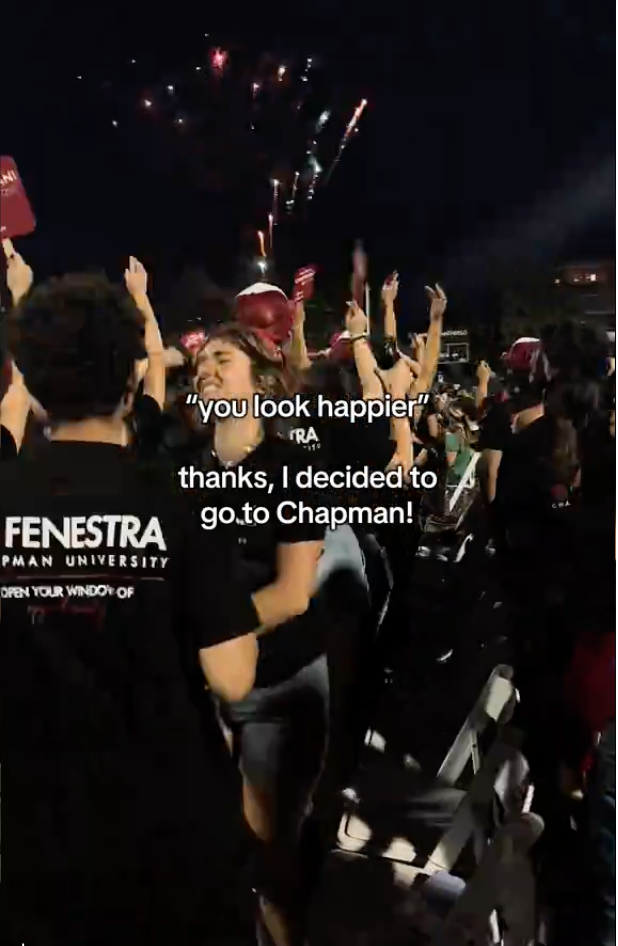
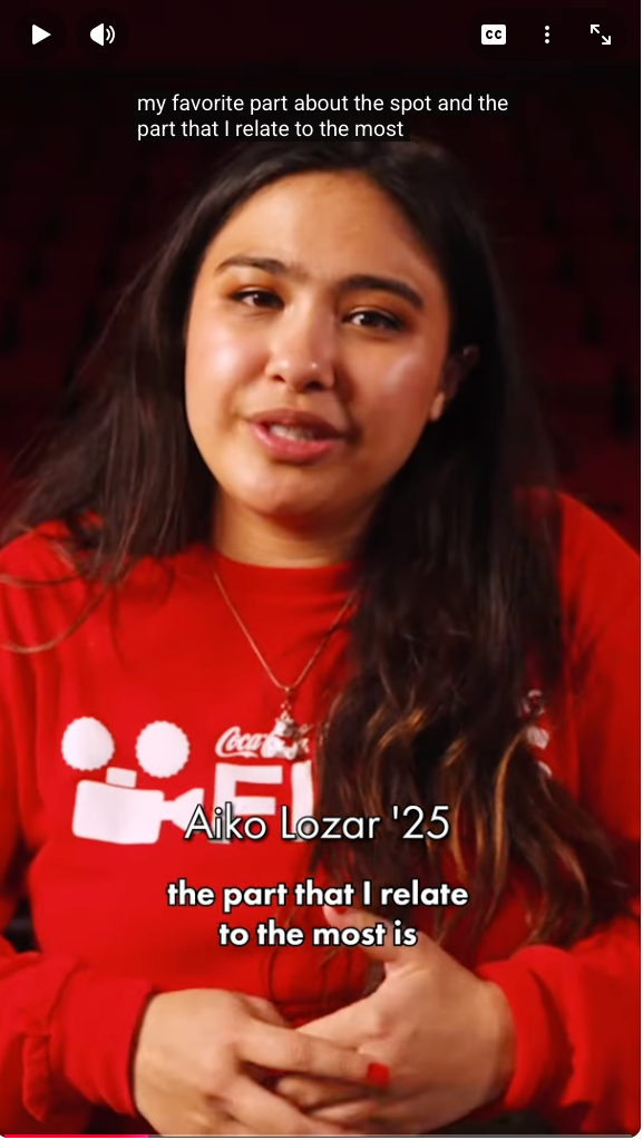
Vertical Video Gallery
Reels, TikToks, and Shorts

Blog RSS Feed
RFI Form with Content
The RFI (Request for Information) Form is useful for collecting inquiries from website visitors. This component takes an embed code and displays the form directly on the page.
Logo Carousel
Showcase a single event callout with a corresponding call-to-action button.
March 28, 2025
Single Event Callout